

Found Objects #15: Letterpress Prints and Posters
Found Objects #15: Letterpress Prints and Posters
A couple of printmaking projects

Back in February, I took a two-day letterpress workshop through the Continuing Studies Department at Maine College of Art & Design. Although I teach in the Illustration department, I had never stepped foot in the printmaking studio. It was refreshing to take a break from my computer screen and get my hands dirty with oil-based ink and drawers of old type.
Before this workshop, I had only printed on a letterpress once in 2019 when I was working on my MFA at The School of Visual Arts. That letterpress studio was located in a cramped space in Brooklyn near the Williamsburg Bridge. I didn’t know what to expect, and I struggled to brainstorm a meaningful quote to print. Once in the studio, my classmates and I rushed around, frantically opening drawers of type, as if we were on Project Runway searching for fabric in Mood on a time crunch.
A technician helped us print in one color. Although my composition had some quirky inconsistencies, it looked like it could have been printed on a computer. I didn’t see the point of spending hours arranging metal type by hand to have such a bland final image. (Not to mention the lead exposure.)
However, while tabling at art book fairs last fall, I noticed so many beautiful, limited-edition, mixed-media letterpress prints, as well as t-shirts with bold, graphic designs printed with old wooden type. I realized that I didn’t approach the medium well the first time around, so this year, I decided to give letterpress another shot.

I was immediately drawn to the wood type, and for my first project, I decided to make something bold, blocky, and related to books.
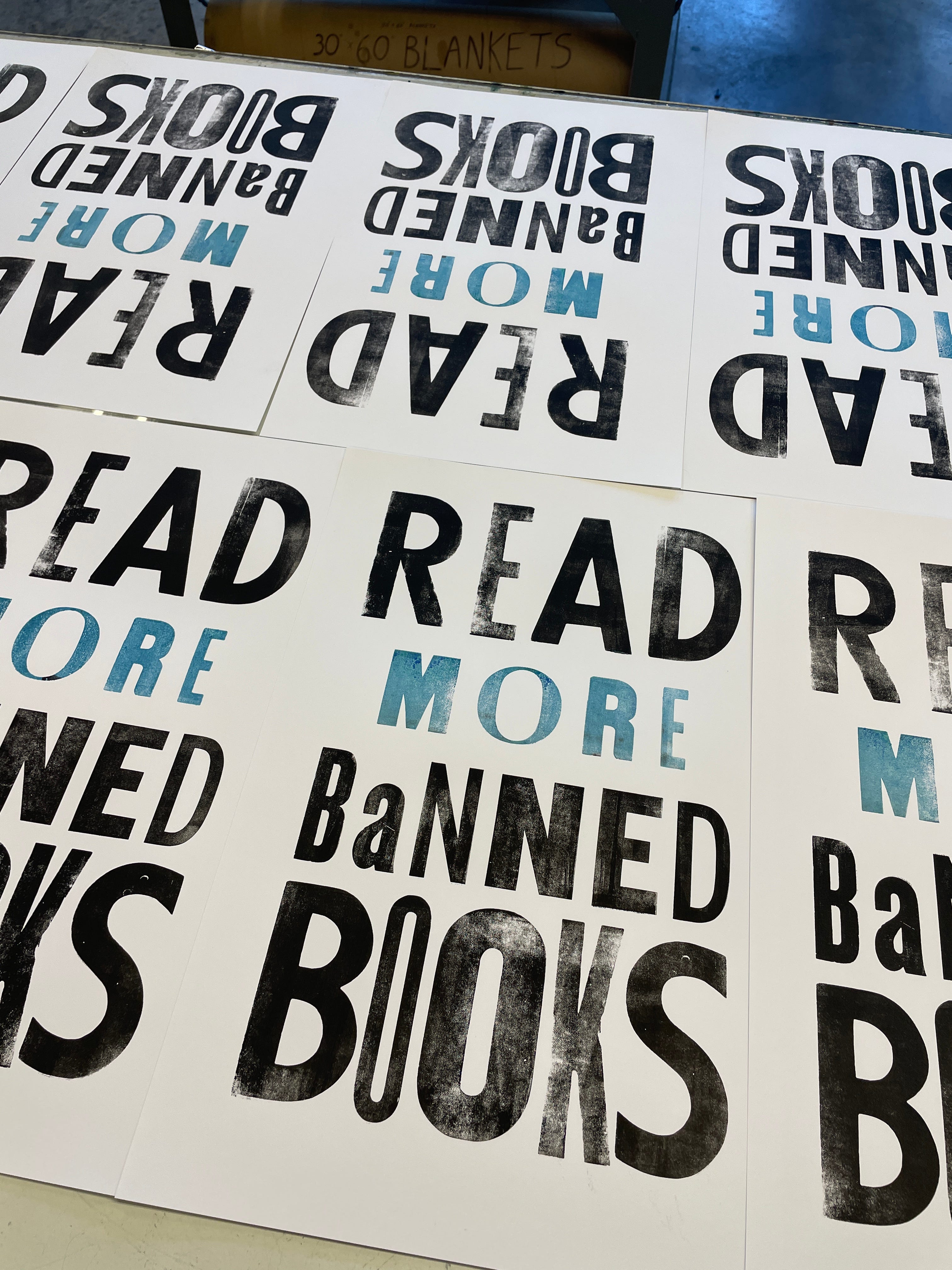

I was thrilled to print on my own and use multiple colors!
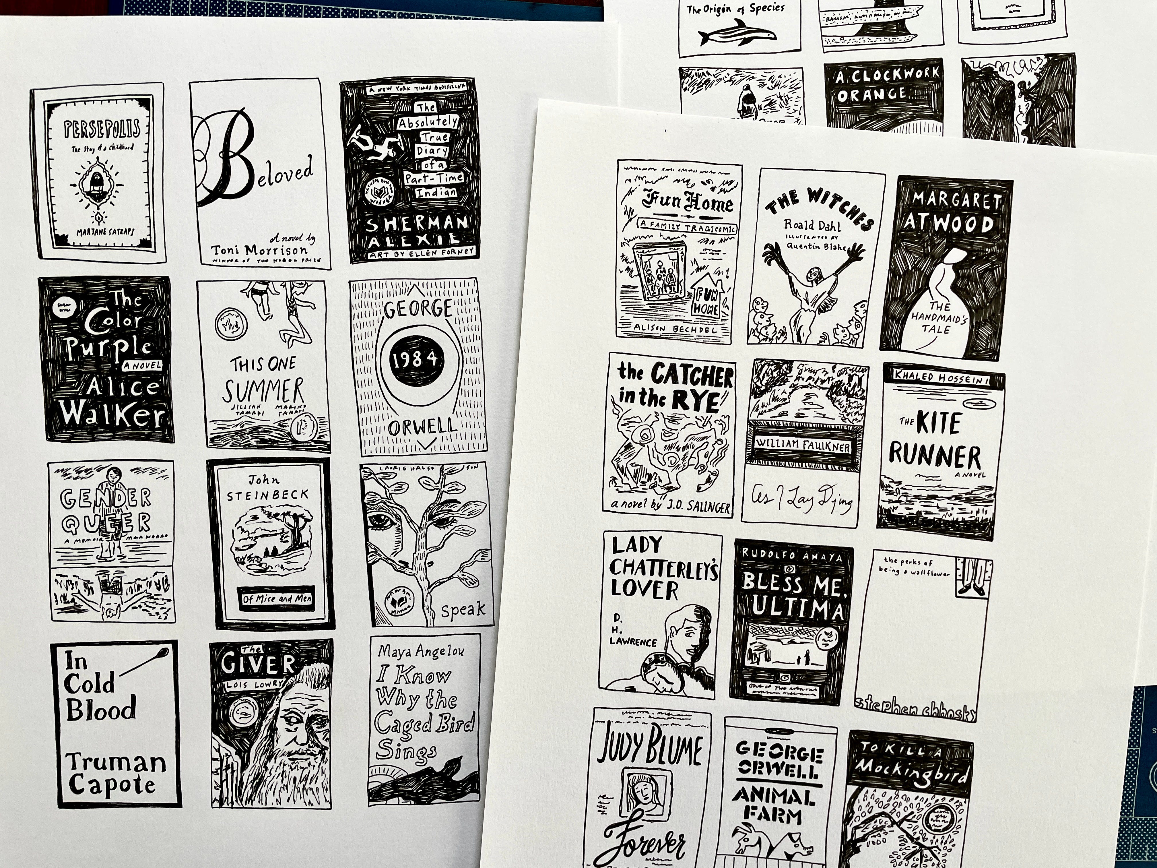
I had an idea to overlay some illustrations of famous banned books. I drew these with black pen in my sketchbook,
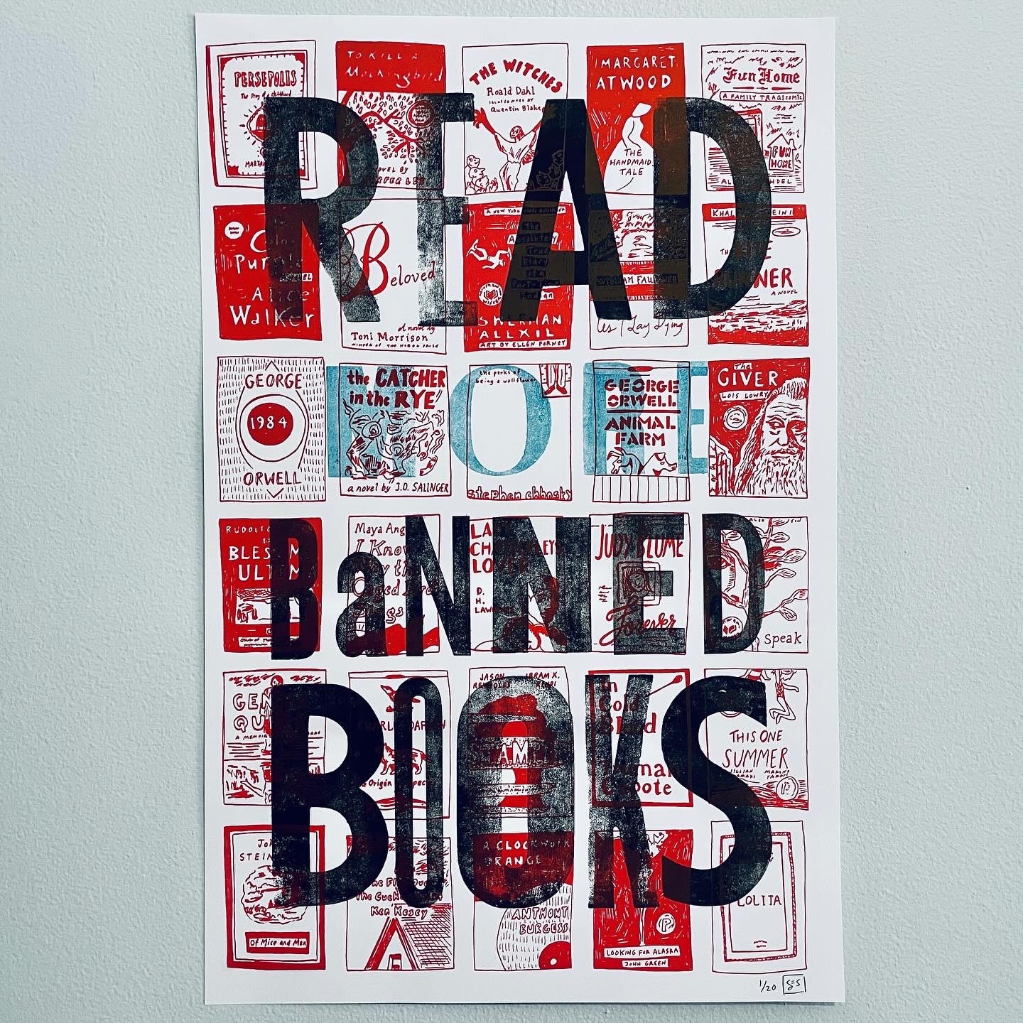
and after letting my letterpress prints dry, I printed the book illustrations in scarlet ink on the risograph! They turned out exactly how I envisioned, and I can’t wait to bring these 11”x17” posters to some art book fairs.
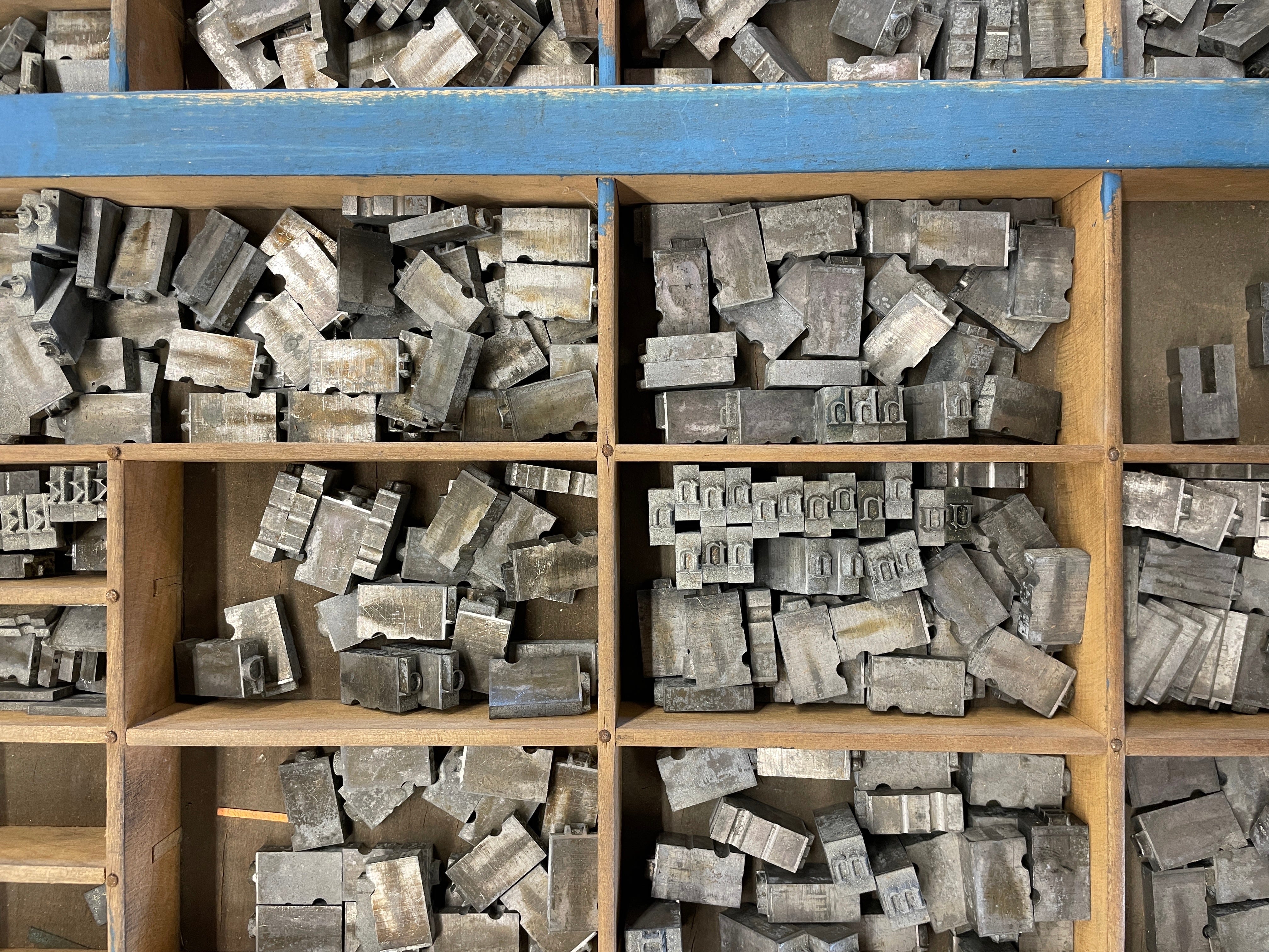
On the second day of the workshop, I decided to try out the metal type.
I had been reading a collection of poetry by Emily Dickinson, and I wanted to assemble one of her famous poems, “I’m Nobody! Who are you?” in 36 pt type. Surprisingly, I was able to arrange the composition in less than two hours.
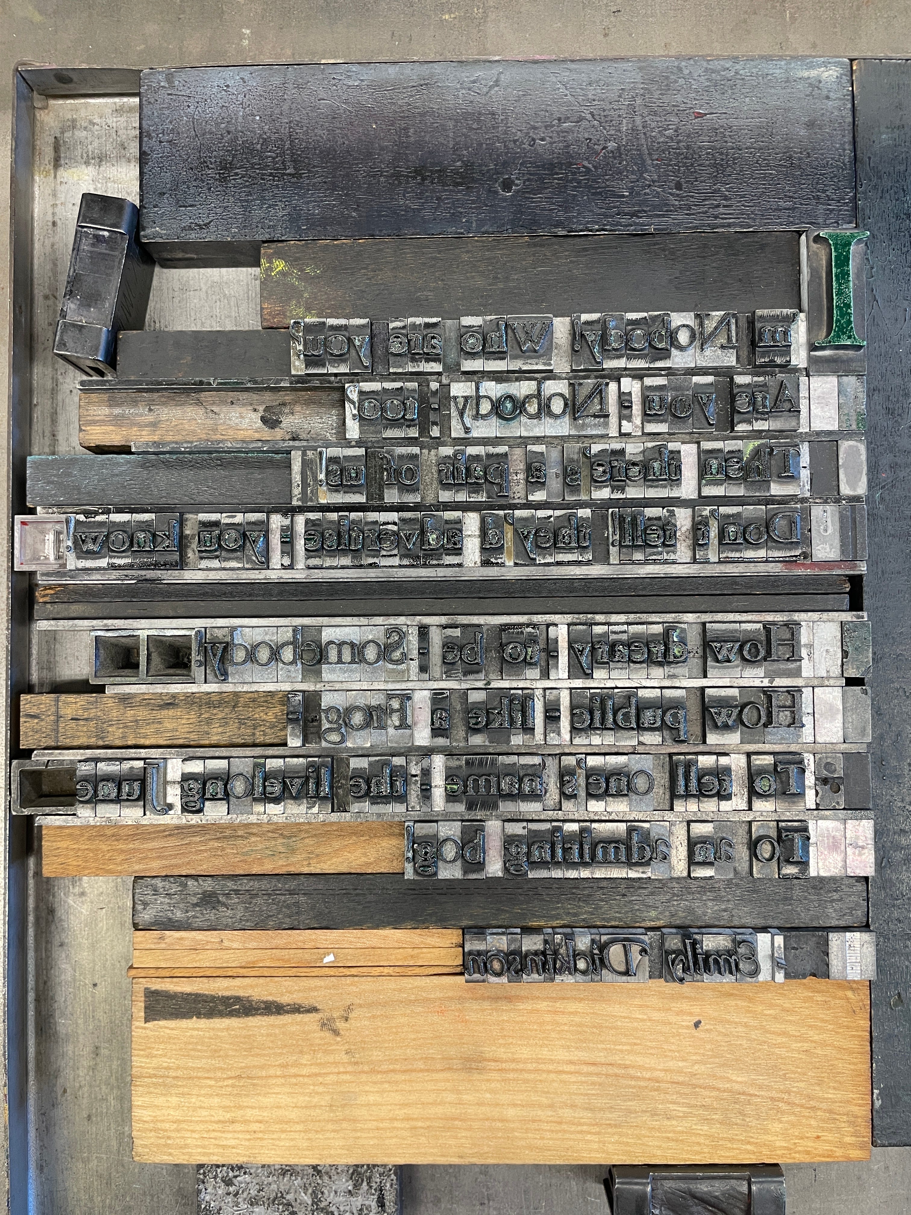
After a few edits, I printed a limited edition in black and green ink on white, gray, and brown paper. I used all of the exclamation points in the drawer, and I love how they turned out.
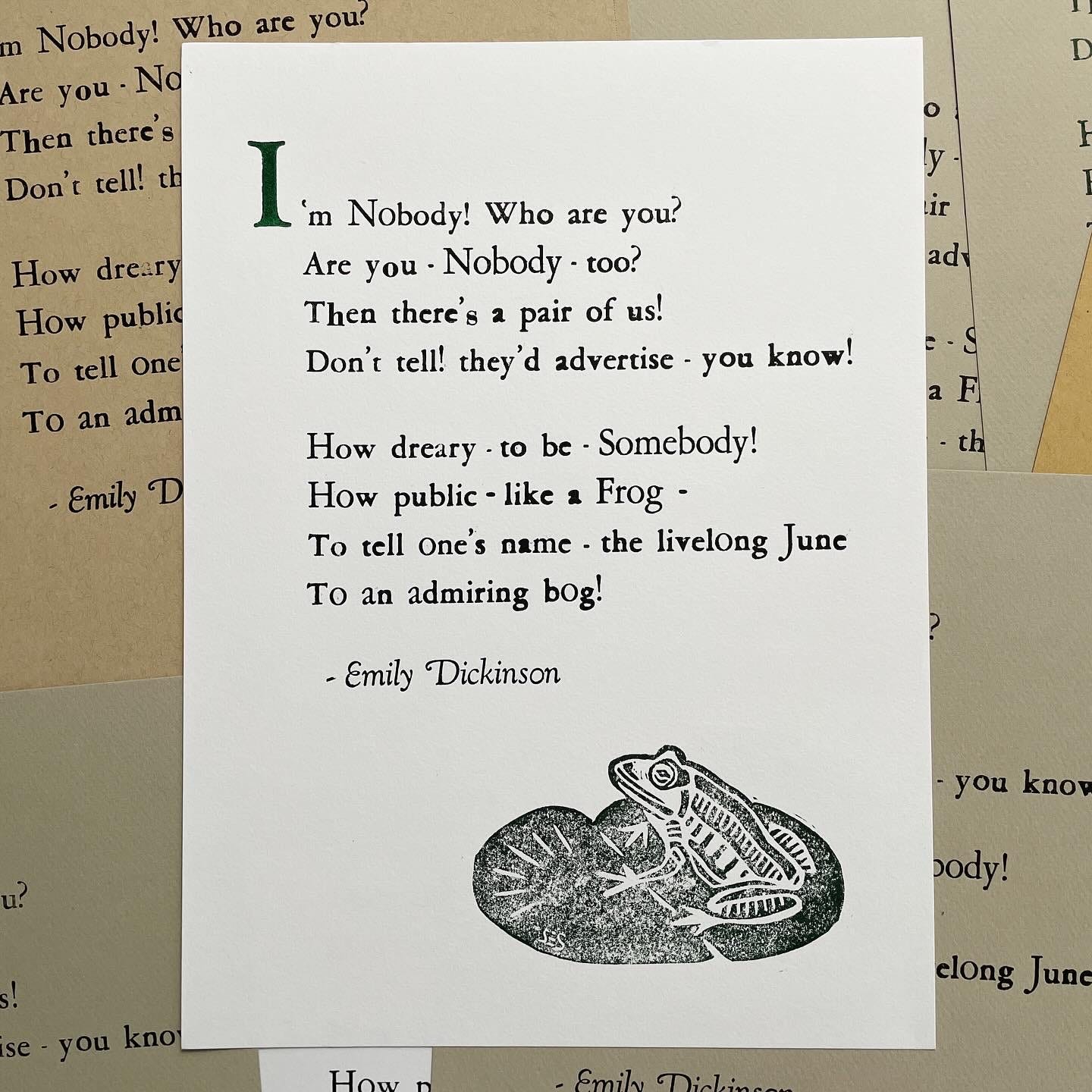
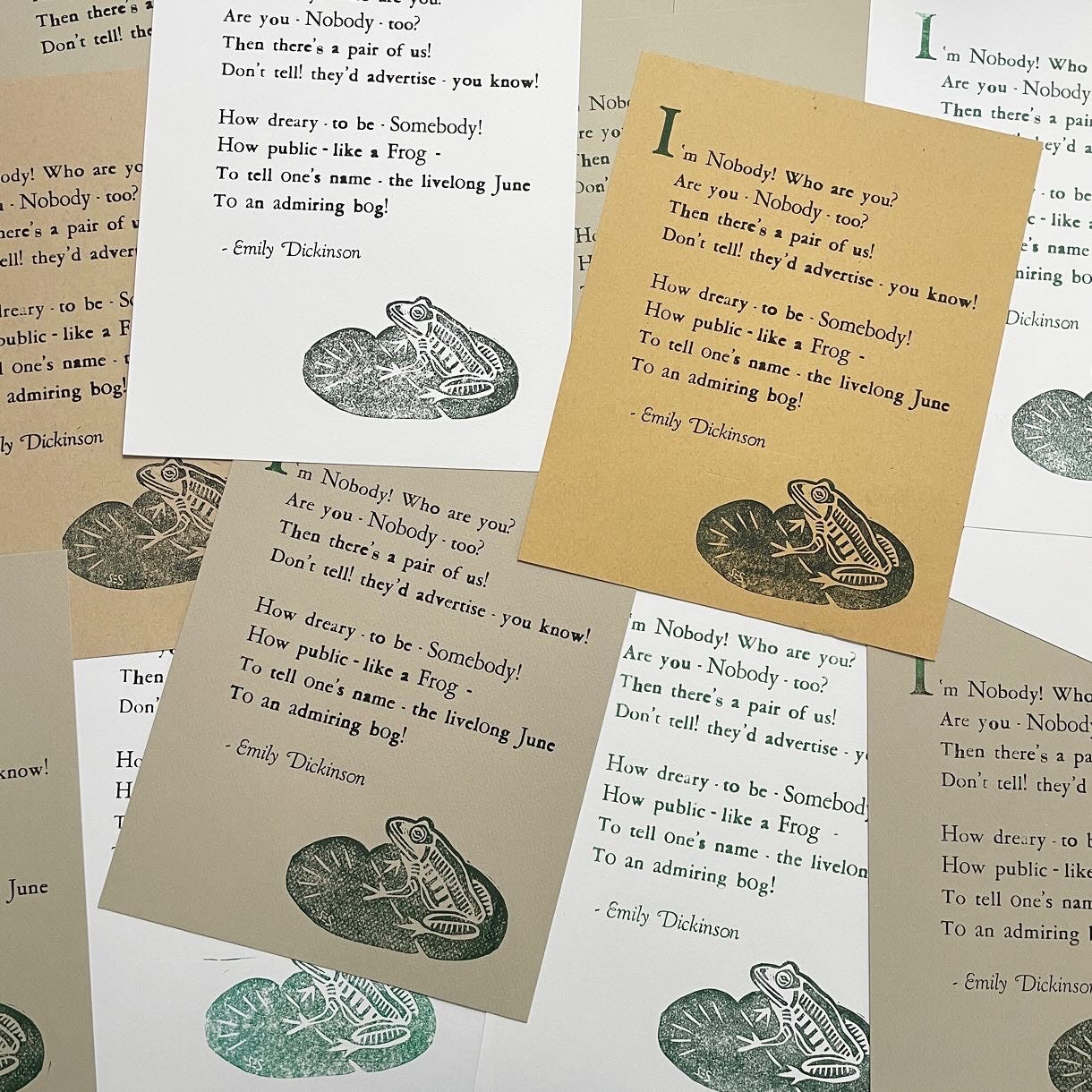
A month after the workshop, I carved this frog illustration to accompany the text. I was nervous to print directly on the same paper, but it all worked out!

I had some toned and colored paper lying around, so I decided to make a few greeting cards, as well.
Overall, I’m satisfied with my prints from this workshop. (The instructor was great!) I love finding new ways to combine text and image, and I think that these two letterpress prints would be pretty boring without the additional risograph and block printing.
For National Poetry Month, I decided to make this Emily Dickinson print the March/April issue of my zine subscription. It’s not technically a zine, but I think it fits into this eclectic collection. Subscribers should be receiving these soon!
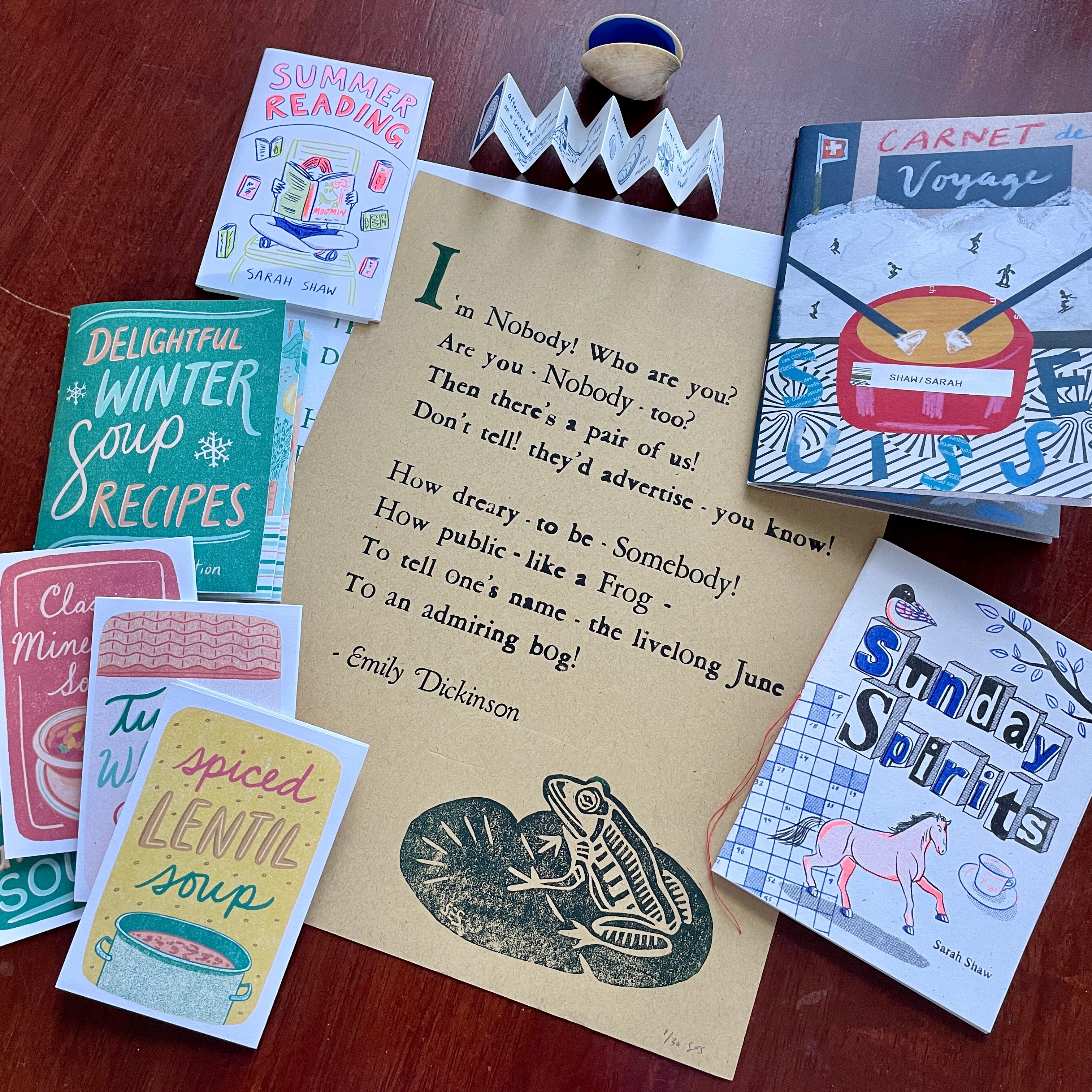
It’s hard to believe that I started this subscription one year ago. (The first issue was May/June 2023.) Thank you to everyone who has supported this handmade, experimental endeavor. I’ve learned A LOT so far. It’s been amazing to welcome new subscribers with each new issue. I will continue to make zines and art prints, and I hope that you’ll continue to follow along. Because of the cost of printing and shipping (and the ambition behind some of these zines), I raised the price to $60/year and $8/month. I hope you all understand.
Stay tuned for the next issue - it will involve a pair of 3D glasses. :)